Project overview

To reflect the app’s evolution from a simple “what to watch” tool into a playful, AI-powered recommendation engine, a name change was essential. The original name, Viewfinder, often led to confusion with photography apps and lacked the disruptive spark the brand needed. We reintroduced the app as Rexy—a name that captures its fun, playful personality while highlighting its core promise: personalized recommendations to guide your streaming adventure.
To reflect the brand’s fun personality, we created a distinctive logotype with funky curves and playful energy. Designed to resonate with it’s younger audience while echoing the delight of discovering your new favorite film at lightning speed.


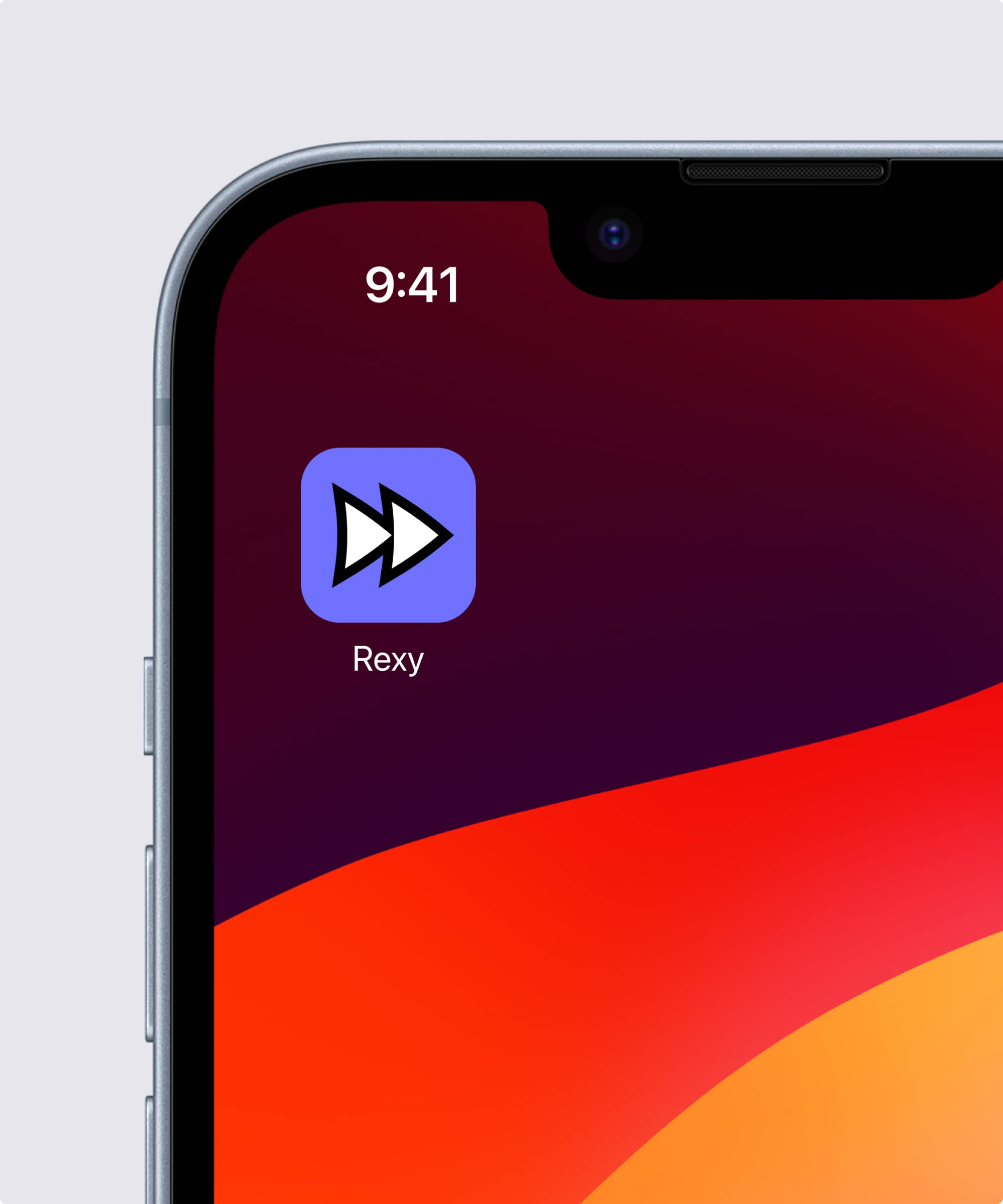
To craft a bold and distinctive identity, we designed a custom app icon that captures the speed and ease of discovery. Its fast-forward form, shaped with playful Rexy curves, embodies the thrill of instant recommendations. We paired it with a highly expressive display font that amplifies the brand’s fun, youthful voice and ensures strong differentiation.
To further stand apart in a crowded market, we developed a signature core brand color—Rexy Purple—an unclaimed, ownable hue that now serves as a primary brand asset and unmistakable signifier. Supporting this, we created a UI-driven palette flexible enough for in-app experiences while extending seamlessly into marketing and more expressive brand initiatives.


Alberto Tretti, VP of Product
Promptu systems
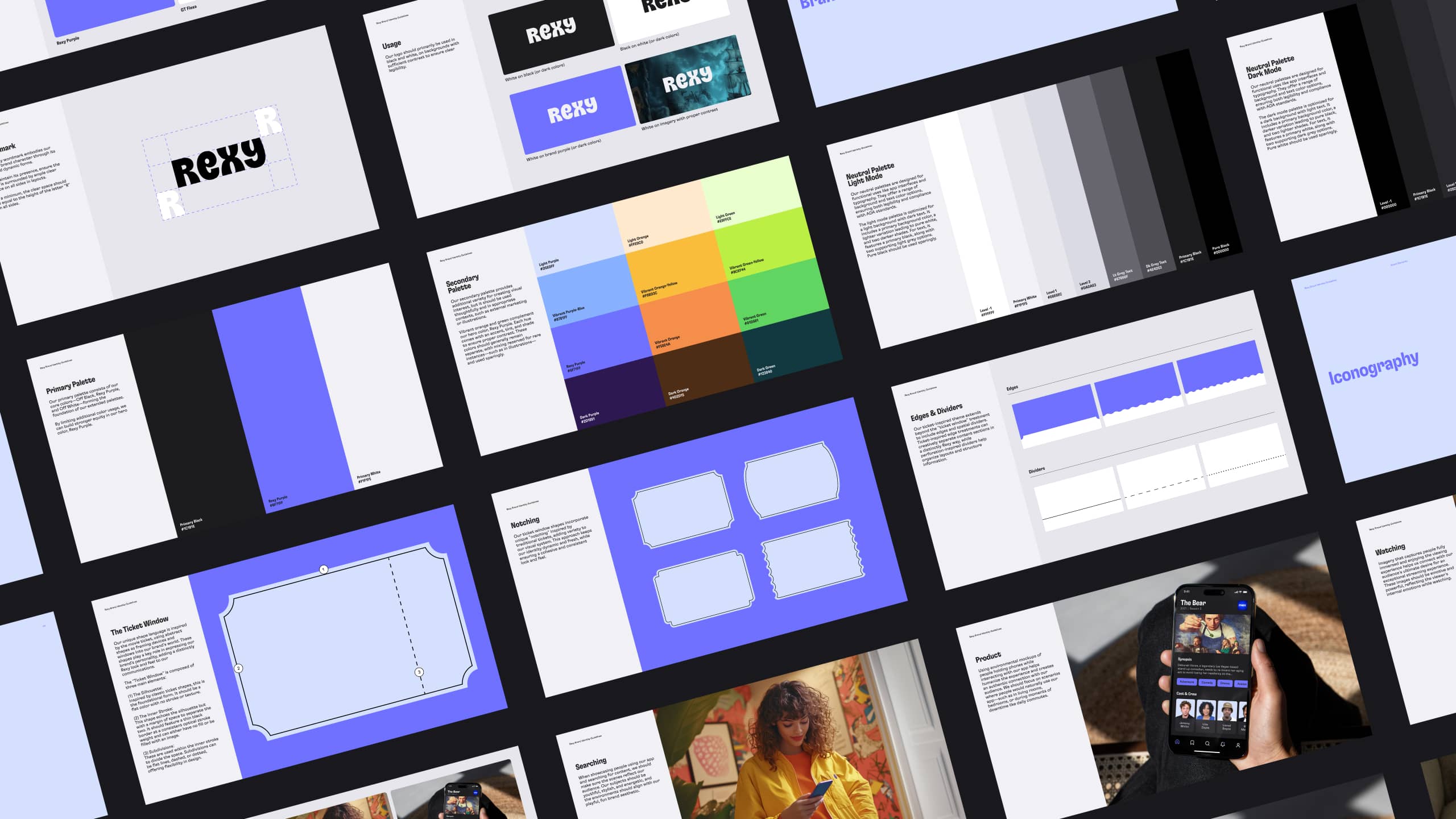
We created a comprehensive brand playbook that captures everything you need to know about the Rexy brand—who they are, how they look and feel, and the way they write and speak. Designed as both a compass and a toolkit, the playbook ensures collaborators stay aligned and consistently on-brand. It covers Rexy’s Brand DNA—the foundation that defines what makes them unique and how we show up in the world—along with voice and tone, messaging guidelines, and visual identity system with clear do’s, don’ts, and use case examples. The result: a resource that drives efficiency, consistency, and quality across every touchpoint, from rollout to ongoing production.

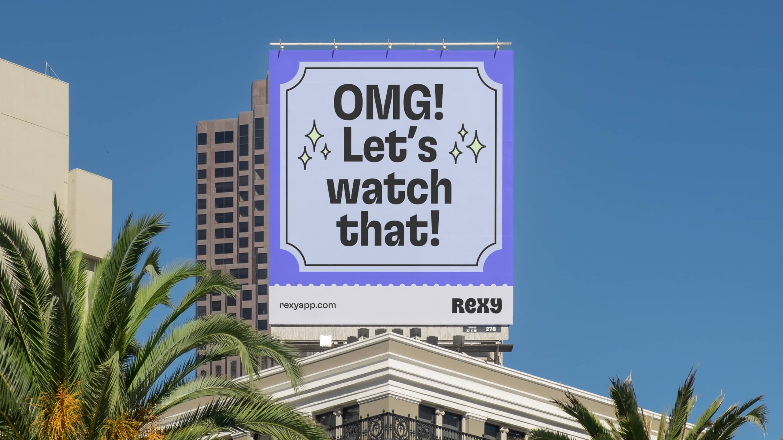
We designed Rexy’s visual system to be flexible, adapting seamlessly across different moments and user touchpoints. For bold, attention-grabbing moments, we developed a graphic system inspired by traditional movie tickets—creating distinctive shapes that communicate the brand even without the logo. In more subtle contexts, we scale back on graphics and rely on Rexy Purple and our core fonts to convey the brand, maintaining its playful personality while adapting appropriately to the moment. This approach ensures a smart, cohesive system that’s both versatile and unmistakably Rexy.
We were tasked with creating Rexy’s launch and loading animations to balance usability with brand expression. The app icon animation was designed to convey speed and responsiveness, reinforcing the promise of finding flicks faster. A playful build animation of the logotype further reinforces Rexy’s brand personality, making the experience feel both engaging and memorable from the start.
our Role
Brand Strategy
Naming
Visual Identity
Verbal Identity
Animation
Collaborators
Promptu Systems
Industry
Technology