Project overview

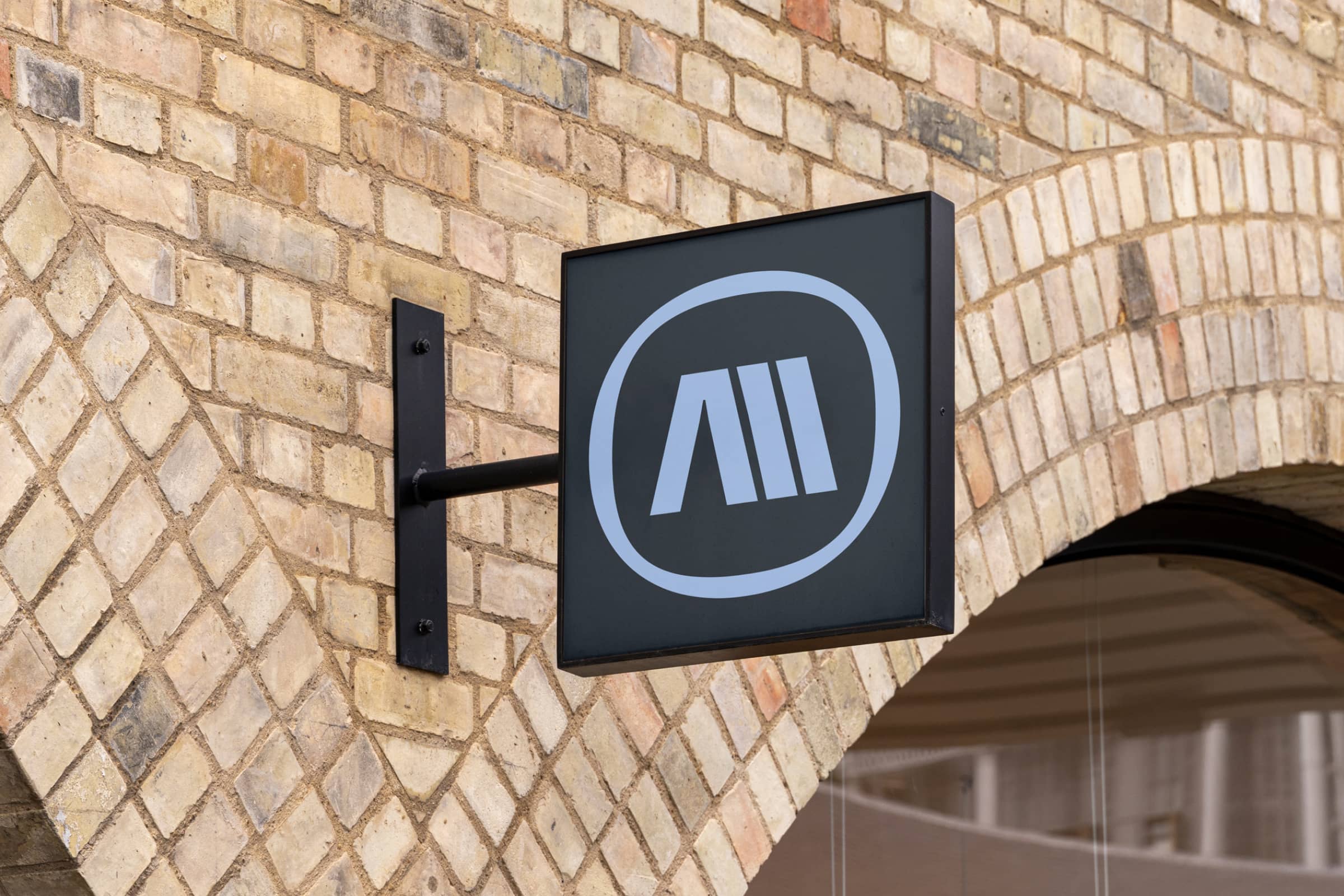
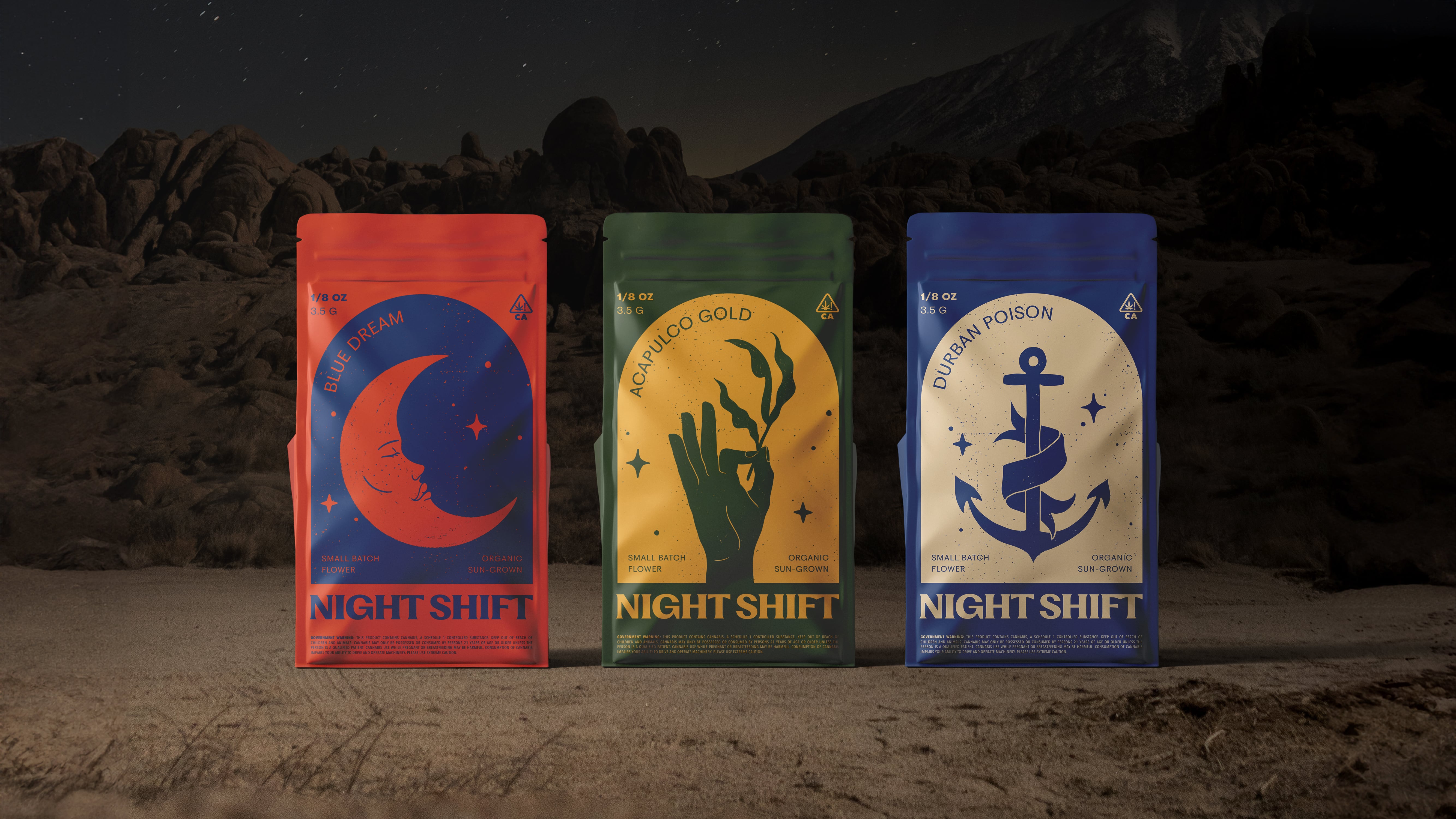
When coming up with a name for the brand we tapped into the mindset of our target audience. Inspired by the changing of mood and feeling of day to night, we agreed this name was the perfect metaphor for the relaxation and relief the product provides. The logotype is set in a typeface that feels modern yet nods to serif styles prevalent in times past, giving it the perfect balance of nostalgia and contemporary expression.

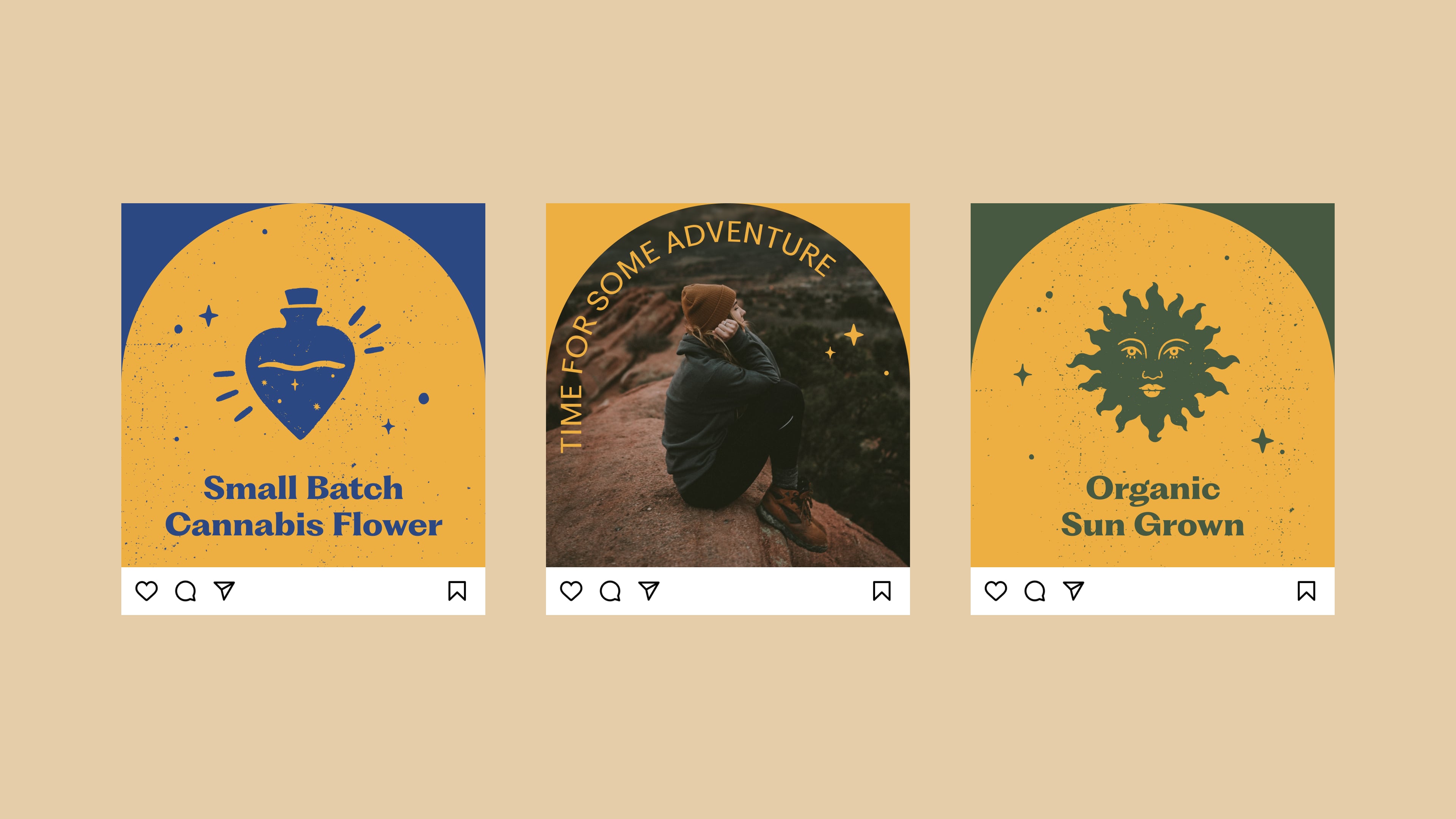
The Night Shift visual language was crafted to tap into the fond memories associated with by-gone eras and nostalgia. From the color palette to the type choices the brand system feels fresh and bold yet comfortable and classic at the same time.
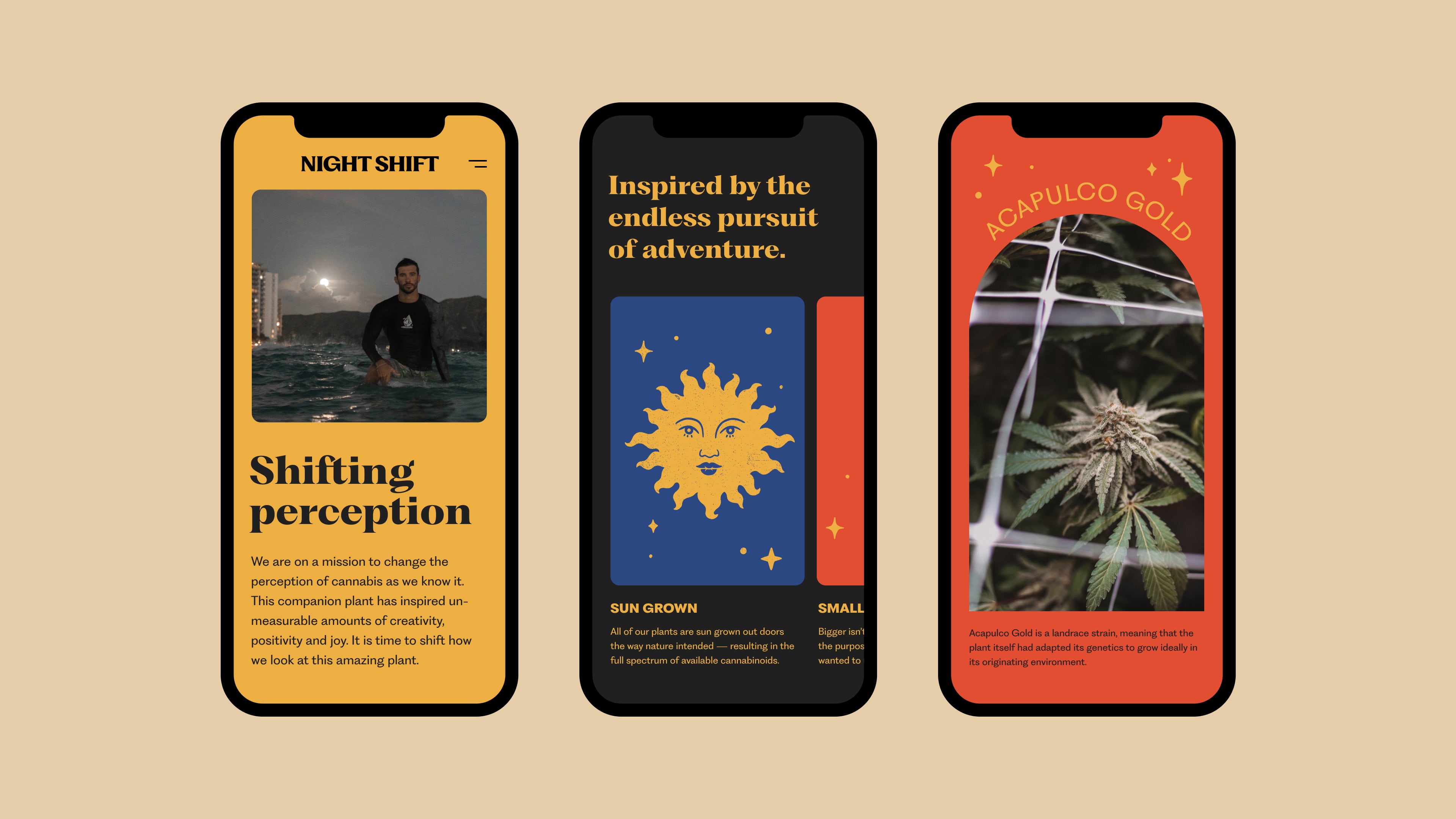
Night Shift's website is their main communication touchpoint that gets their unique story out into the world. It's also an important functional tool for customers to be able to find their products nearby or order online. We used our newly formed visual identity system combined with it's messaging framework to tell their story in an unforgettable and interesting way. Tapping into the colors, textures, imagery, fonts and themes from the brand — we created an engaging way for customers to connect to the brand on a more emotive level and be able to find and buy products.
our Role
Brand Strategy
Naming
Visual Identity
Verbal Identity
Website
Collaborators
Nightshift
Industry
Cannabis